Don’t Just Put a Bird on It : Branding Beyond the Logo
In today’s varied and ever-evolving marketing environments, the visual identity of your business must reach beyond simply applying a logo to print or digital materials; it must generate an overall brand experience that your existing and potential clientele can easily perceive. A strong brand consists of a “flexible” yet cohesive family of fonts, color palettes, icons, and messaging that permeates the market and ignites awareness and appreciation amongst your target audience.
M studio became further convinced of the effectiveness of comprehensive brand families after seeing Simon Manchipp speak at 2012’s Brand New Conference. Manchipp, a founding partner at London-based design practice SomeOne, first introduced this concept in 2010, stating that a brand’s “success lies in the richness of its brand world… This forms a flexible branded platform that is instantly recognizable – you could remove the logo and still know the brand. The logo in itself is not the ‘hero’.” For an example of such a branding platform, think Target. The imagery, music, font families, patterns, and colors utilized in their commercials all say “Target” before the name “Target” or their logo ever appears on screen. They are immediately unmistakable.
Though the logo will always exist, it does not have to be the be-all and end-all to any entity’s brand success. Recognizing the brand beyond the logo creates a stronger relationship between brand and audience without the need for overt marketing ploys. This is why M studio encourages new and evolving businesses to embrace flexible branding. From tiny 16×16-pixel favicons to large-scale murals adorning building facades, comprehensive brand families support wide ranges of applications. By providing options for more varietal usages, flexible branding elements delicately cut through the noise of an over-saturated market and increase brand presence. This subtle and sophisticated approach to increasing brand recognition and loyalty allows a brand to connect with its target audience organically rather than sell to them.
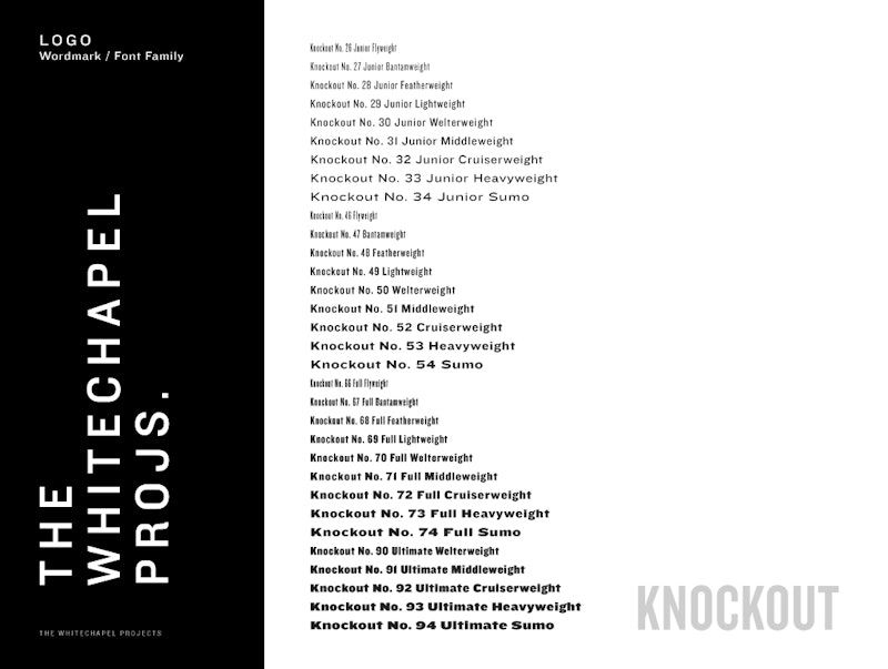
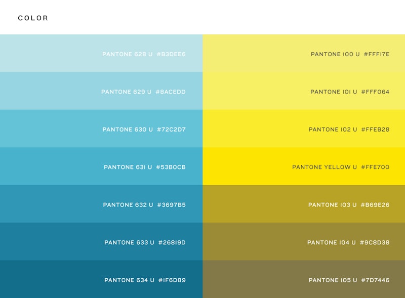
When creating the branding for The Whitechapel Projects, a soon-to-open multi-use space consisting of a nano-brewery, restaurant, art gallery, and music venue, we developed a cohesive brand family as open to reinterpretation as the space itself. By approaching brand exploration from multiple angles to arrive at one unified theme, we created a branding system of graphic elements and iconography that speaks to the many influences and identities of The Whitechapel Projects. Drawing inspiration from the avant-garde modernist movement, Andy Warhol’s Factory, self-sustained communities and ecosystems, and The Whitechapel Projects’ physical architecture, we developed a holistic, overarching brand identity.
![]()
![]()
![]()

