What’s Old Is New Again : Executing a Successful Brand Identity Update
With thousands of brands vying for audience attention through innumerable on and offline marketing platforms, the first challenge for acquiring business and gaining customer loyalty is simply getting noticed. While the aesthetic appeal of a brand is of utmost importance, making a brand attractive to your potential clientele does not mean relying on fleeting color or typographical trends. A brand identity that visually embodies the ideology behind the goods, services, or ideas being represented builds buy-in and attracts brand loyalists who will continue to stand behind the value of those offerings.
In order for an established brand to stay in touch with its audience while speaking to its personality, promise, and purpose from year to year and decade to decade, that brand must evolve over time. If a business or entity finds that its brand identity is no longer relevant to its ethos or has ceased to connect with its audience, that entity may consider a brand update. Likewise, if a business seeks to communicate a change or advancement in its business model, it can do so through brand redevelopment. Such updates, when properly executed, improve brand coherency and thereby increase audience understanding and drive ongoing brand loyalty.
Though a brand identity update generally symbolizes the progressive growth and forward-thinking nature of a business or entity, this updated branding must also pay homage to the history of the brand. By focusing on the future while hinting at the past, an updated brand identity can engage a new audience without running the risk of alienating its existing base of loyalists.
To ensure the final updated brand identity seamlessly balances its roots in the past with its vision for the future, M studio’s team of graphic design and marketing experts begins every brand redevelopment project by initiating research and analysis. Then, drawing from our findings, we execute the design process and collaborate with top project stakeholders in order to develop a finalized concept.
…
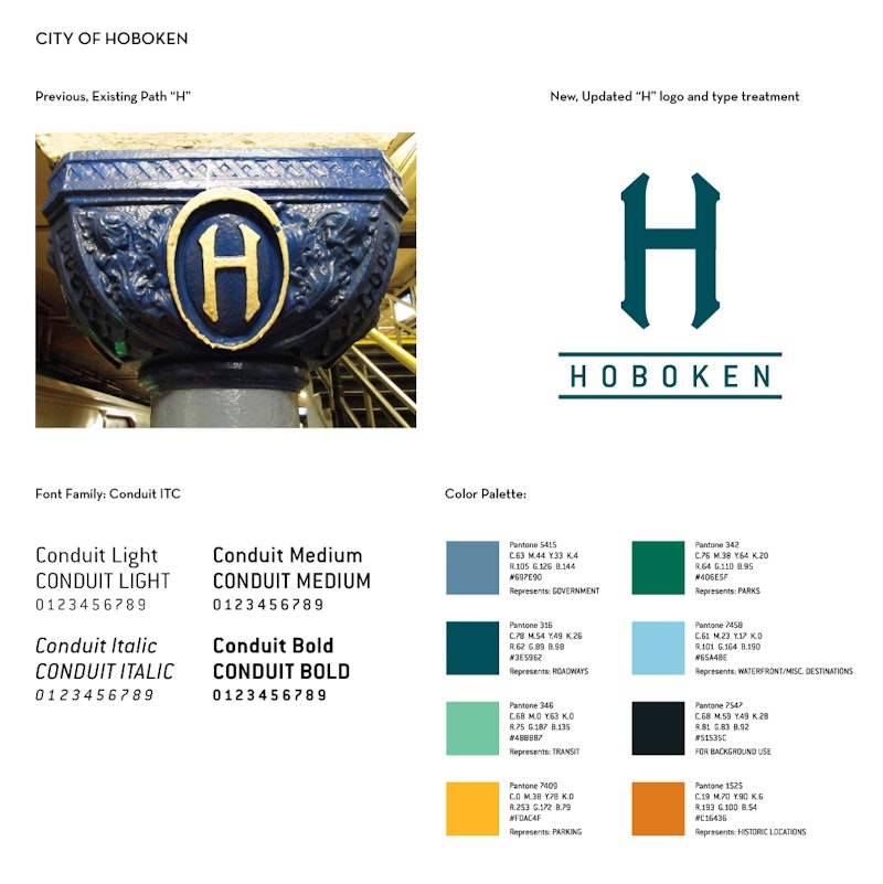
When developing a cohesive brand system to be utilized on wayfinding materials throughout Hoboken, New Jersey, M studio drew inspiration from a well-recognized and much-loved “H” adorning the pillars of the city’s bustling railway station. We removed the “H” from its ellipse and increased the mark’s structural integrity, allowing for a wider range of application purposes. The final mark – a modernized iteration of an established symbol of the city – speaks to Hoboken’s progressive community while honoring its proud historical roots.

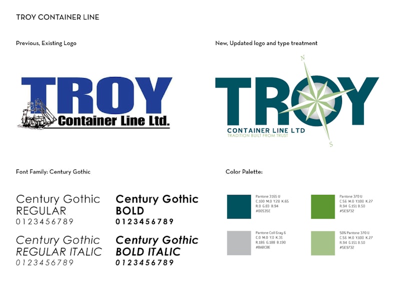
In 2011, leading NVOCC Troy Container Line turned to M studio to parallel the company’s growth and its introduction of new services with an update to their branding. We implemented a similarly bold type-treatment and replaced their ship with a compass, thereby maintaining the logo’s reference to the company’s strengths and navigational expertise while applying a more contemporary nautical aesthetic.

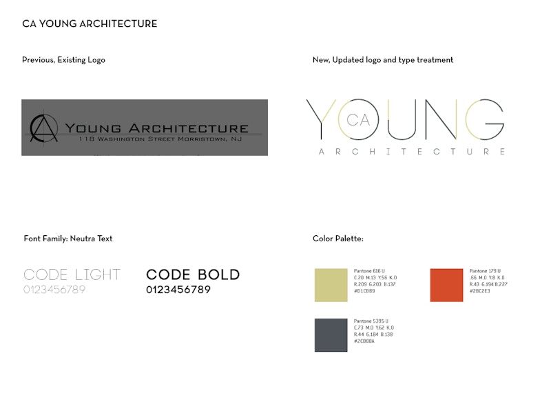
Looking to elevate her firm’s brand identity and attract a more high-end, design-savvy clientele, Carolyn Young, the founder of CA Young Architecture, sought M studio’s branding expertise. Retaining the original mark’s linear typestyle, we implemented a cleaner, sleeker type-treatment to develop a logo that visually embodies the firm’s classic sensibilities and modernist approach to architecture.
